A Tribute To...The "S" from Hell,
The Screen Gems "S" Logo

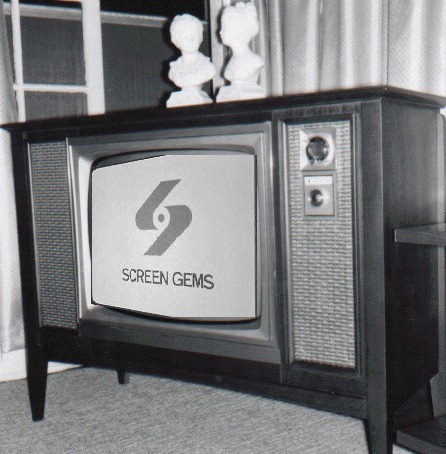
The image you see on the above television screen may seem innocent enough and not scary at all, but to many of us who watched television as small children in the mid 1960's through the early 1970's, it was the most frightening thing on TV. In exteme cases, it caused nightmares and prevented the viewing of programs that used the logo, which was shown after the closing credits. Some even call it the "S from Hell". I myself was one of these children, though not an extreme case. I was so scared by it that I would just stare at it, though sometimes it would get to me and, as the closing theme of one of the shows that used it was winding down, I would hide behind the sofa. Today I find this symbol an interesting piece of commercial art and worthy of its place in television history.
Shown on the above screen is the logo for Screen Gems, the television division of Columbia Pictures, that was used from 1965 to 1974. It was shown after the closing credits of now classic Screen Gems programs from this period: Bewitched, I Dream of Jeannie, The Monkees and The Partridge Family.
The segment was accompanied by music that has been described as "creepy". Click here to hear a WAV file of this. It is a five second violin and synthesizer piece, six notes followed by two synthesized tones. In 1971, this music was shortened to only three notes before the tones...click here to listen. By this time I had outgrown my fear of this symbol, although the shortened version seems less scary. Most feel it was the music that made it so dreadful.
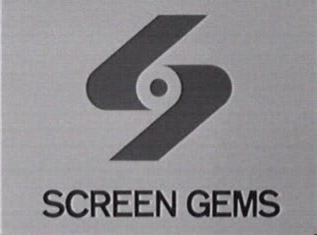
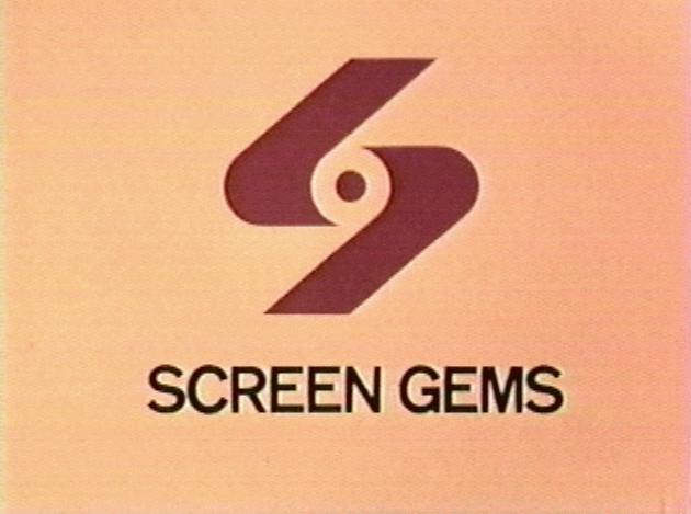
Maybe it was the movement that was shown on the screen that seemed scary. The scene began with two parallelograms, one near the top center of the screen and one rising from the bottom of the screen. The top parallelogram was at a distance and moved in closer while the lower one was closer and moved away. They began to move together, growing in legnth. When they got close to each other the two sections wrapped around a dot, which simultaneously appeared in the center of the screen, forming the S. The dot may be meant to represent a hub of a film reel. While this was happening, the words "SCREEN GEMS" came forward between the S and the bottom of the screen. Maybe all this action at once was too much for a young mind to comprehend. It was shown on a yellow background with the S being red sometimes, black other times. I think it looked more eerie on a black & white set, when the background showed up as white and looked much colder.
Perhaps we felt sorry for the dot seeming to be captured and trapped by the two parallelograms. Some of the more neurotic viewers maybe felt the parallelograms would sneak up and capture them, maybe while they slept (hence the nightmares). Maybe the whole thing was planned to be a way to get us kids to watch less TV.
Whatever the reason we were so terrorized by this, this closing logo will go down in TV history as one of the scariest. The S logo is practically extinct today, although the great people at TV Land seem to be making a point of playing the original logo after the old shows where it used to be. After 1974, the Screen Gems shows mentioned above had newer Columbia or syndicator's logo replacing the S. Current motion pictures by Screen Gems are using a new version of the S logo, the same design but now silver with a blue reflection on a black background.
I would say the creative mind or minds that created this closing logo segment did an excellent job, they made this icon so memorable even after all these years, and it still gives me the chills!
If you'd like to see a screen shot of the Screen Gems "Swizzle Sticks Logo" which, as I'm told, predates the "S from Hell", check out this Bewitched page. I remember the swizzle sticks at the end of Flintstones episodes, but can't recall where else I have seen them.
Click on the appropriate logo below to see AVIs (each 2M) of the black & white and color versions in all their glory. I was able to capture the black and white one following an early episode of I Dream Of Jeannie, and the color one following an episode of Bewitched on TV Land. It's interesting to note the comparatively smaller graphic and lettering in the later color version, possibly to make it less overbearing.


If you are interested in some history about Screen Gems, check out the Screen Gems Wikipedia entry.
I should add another thing that really gave me the creeps was the 1960's NBC Peacock. Something about that music and pattern of colors really creeped me out when I was a little kid. Click here to see what I'm talking about.
And, if that wasn't enough fun for you, here are three more creepy mystery closing jingles. The first one is easy to identify (especially if you are an MST3K fan), the second much tougher, and the third even tougher. Be warned!!!! Numbers two and three will drive you crazy if they sound familiar but you can't figure them out.
E-mail me if you give up and want me to identify them for you.
An update on December 12, 2008: Apparently, the scary logos have affected more people than I thought. There are a number of collections of scary logos on YouTube. Here are some links to the better collections I found. (The various links have a number of repeats among them.)
- YouTube - Scariest TV logos from our childhood!
- YouTube - More of TV's Scariest Logos Ever!
- YouTube - 10 Scariest TV Logos of All Time
- YouTube - Top 10 Scariest TV Logos
An update on May 29, 2010: Believe it or not, someone actually made a short film about The S From Hell, and it was selected to be shown as part of the 2010 Sundance Film Festival. I kid you not.
The original version of this was created by John S. Flack, Jr., and was reprinted with permission. (Thanks, John!)
Problems with the website? Additional questions? E-mail the webmaster.